A Few Copies of Hiroshige (2022)
A Few Copies of Hiroshige
Accurate Representation of Symbolic Signs
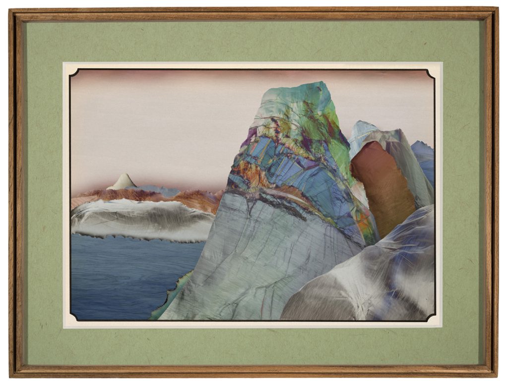
Artwork, especially museum artwork, reproduction photography comes with its own charms and challenges for the photographer taking on the task. The close encounter with the artwork, considering its material, often reveals hidden details that are usually overlooked in typical wall displays. This issue becomes particularly pronounced when dealing with a historical artwork because, on one hand, public displays often limit visitation proximity to such pieces; on the other hand, despite the artist’s finesse in utilizing the material, they still carry traces of the passage of time.
In the last few decades, thanks to advancements in imaging technology, numerous pieces in museums have been photographed multiple times. A few decades back, these artworks were usually captured on photographic film. With the advent of digital sensors, they got photographed again. Nowadays, with high-resolution and wide-spectrum sensors, many of these pieces are re-photographed. Having a few photographs of a piece from various decades allows us to obtain information about the visual transformations the work underwent over time. Certainly, signs of alteration are the first things one can discern. However, information about color transformation in the works can be accessed if accurate color representation is available.
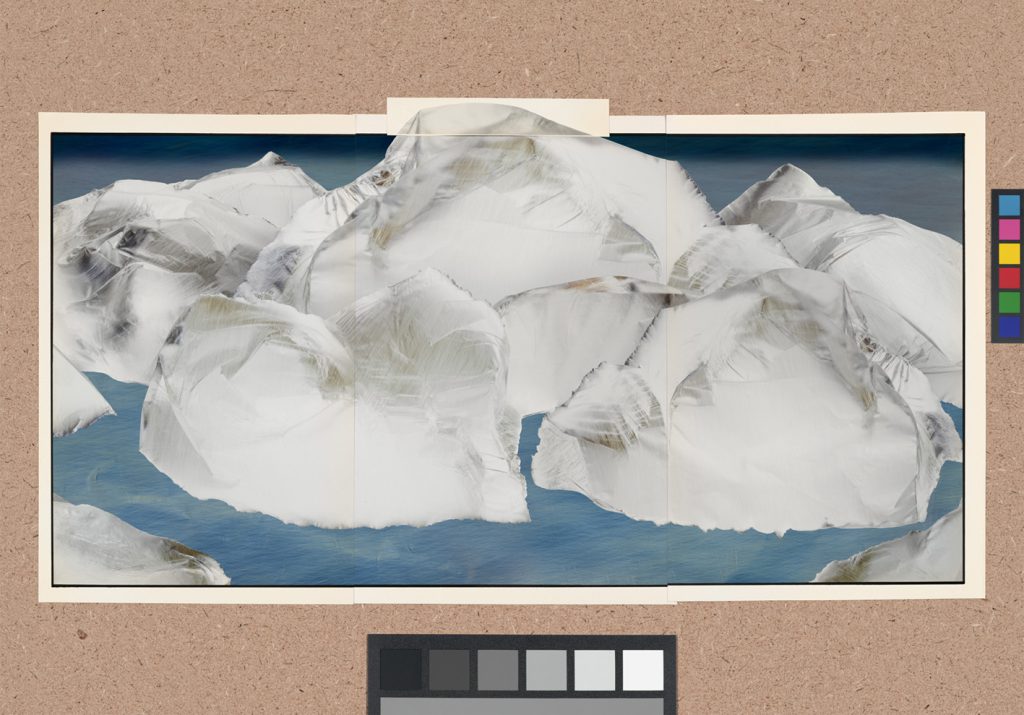
Color alteration in museum pieces, particularly in materials such as paper, are readily apparent. Over time, this material undergoes a change in color because of reactions stemming from its exposure to various factors such as light radiation (both visible and nonvisible), atmospheric contact, and inherent chemical responses of the paper constituents. The color change typically does not occur uniformly; this is because papers are commonly stacked or kept bound, resulting in greater air exposure at the edges of the papers. Consequently, color change occurs more prominently at the edges of the paper than its center.
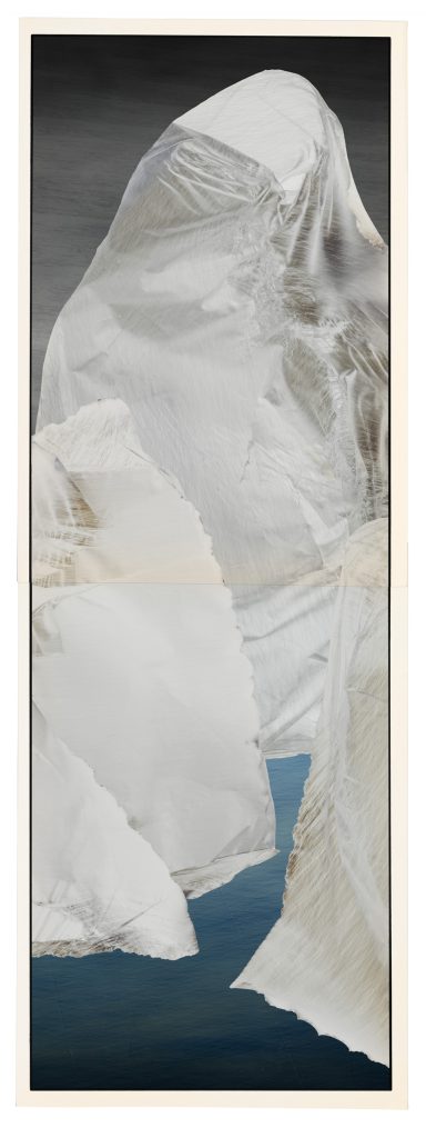
Whan paper serves as the physical context for written texts or even monochromatic drawings, the alteration of the paper due to referencing its age may be perceived favorably, if it does not critically affect the health of the work. However, when discussing paintings or color prints, this color change in the physical context of the artwork also leads to a change in the color of the piece itself. This matter becomes more critical when the artwork exhibits non-uniform color alterations. This issue is compounded in polyptych images, as juxtaposing printed copies reveals that the color change in the paper edges translates into color variation in the central segments of the main image.
When provided with images containing intricate details of an artwork, one can rely on the information contained within the images to examine physical damage more accurately. This facilitates the examination of certain damages that have occurred to the artwork over time. However, to ensure the accuracy of color and contrast representation, simply examining the image and even comparing different images may not appear adequate. For instance, the increased warmth of color in a digital image compared to an image photographed on film several decades ago cannot be readily equated to an alteration in the color of the artwork. Because various factors such as disregarding color management processes and even color shifts in film over decades render this comparison invalid.
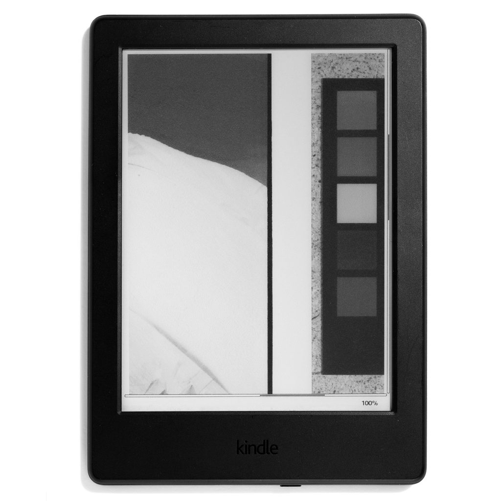
However, when it comes to comparing the color rendition of diverse images of one artwork captured over the course of several decades, a more fundamental challenge arises: The response of different sensors to changes in color and light varies, and they cannot be easily compared with one another. Standard color charts are employed to overcome this challenge. These charts serve as simple yet accurate and practical tools; the most basic of which typically consists of several shades of gray, along with primary and complementary colors. Thus, by having a standard reference in the image, the photographer has a measure for adjusting brightness, contrast, color temperature, and hue. Certainly, though these charts are often introduced with related software, achieving accurate results is not necessarily straightforward.
The primary challenge in attaining accurate image of the chart lies in ensuring appropriate lighting conditions. Although the colors of this flat chart may appear matte, simply lighting the environment for photography should suffice; however, improper positioning of the light source can result in minimal direct reflection from each segment of this index, leading to a loss of color accuracy. To recognize direct reflections, the periphery of this index is coated with semi-gloss texture. This semi-gloss surface aids the photographer in ensuring the absence of direct reflections on the color chart. Thus, while the application of the color chart may appear plain easy, access to the data within the chart is contingent merely upon the uniform lighting of all semi-gloss sections therein. Following capturing of an accurate image of the color chart, the photographer must adjust the color deviation with the help of the provided software. Subsequently, if necessary, adjustments to color temperature, brightness, and contrast should be made to meet the standard level. Although automatic color adjustment with the assistance of a color chart is available in all modern software, manual adjustments for brightness, contrast, and color temperature are often imperative due to the inability of many software programs to automatically adjust these settings.
Therefore, for the accurate representation of color, luminance, and contrast in photography, the data of the color chart should be made available to the accompanying software after capturing an accurate image of the color chart. Additionally, the color temperature and luminance of the photo should be adjusted selecting the appropriate gray index. So far, if we’ve taken a photograph with variety in color and tonality, and subsequently observe the final image on a standard display, both the image and the subject appear highly similar. However, when we photograph a monochromatic artwork with limited tonality, there’s typically a discernible contrast between the object and the resulting image. For this reason, it is recommended that in accurate photography (such as museum artwork reproduction), the image contrast should also be assessed and manually adjusted, if necessary, through intrinsic image indices. Obviously, all the manual adjustments should be made in a color space where color and luminance operate independently from one another. Of course, ultimately, there always remain differences that are not necessarily due to inaccuracies in software or color charts. Some of these differences are attributed to the camera sensor mechanism, which cannot be thoroughly adjusted despite utilizing color indices and software. This matter becomes particularly decisive in the process of reproduction by photographic film because this material undergoes color shifts over time, and these shifts vary inconsistently across different colors and tonalities. Hence, in accurate reproductions, it is customary to document a color chart alongside the subject in the photograph.
In conclusion, while achieving exact color representation is not feasible due to the complicated representation mechanism, the accuracy required for the media presenting museum artworks such as books, catalogues, websites, etc., is fully met.
The complexity of accurately representing color, in comparison to accurate representation of details, can be viewed as evidence supporting Vilém Flusser’s assertion that a color photograph is more symbolic than a black and white one. Here becomes evident another distinction between darkroom and blackbox. A moving and colorful image in a darkroom can be recorded merely as a trace on the sensitive plate without the intermediation of color filters. As already mentioned, the accuracy in representing details of an object can often be assessed through image information. The color representation achieved using color filters on sensors requires a deeper understanding of complex technical knowledge. This very complexity is why color images are often considered more symbolic than black and white ones. Certainly, being more symbolic here connotes a heightened challenge in achieving accurate representation.
A Few Copies of Hiroshige is an endeavor towards accurate representation of examples involving all challenges inherent in the process of accurate reproduction. (Written by Roozbeh Maleki, Translator: Niki Shadloo)